A quick introduction to data visualisation
Data visualisation is one of the most powerful tools we have to understand the world and raise awareness about important issues. It is not about creating fancy charts. Encoding information onto visual elements can and has changed the world.
 Thanks to
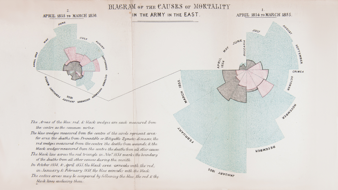
Florence Nightingale’s visualisations about deaths during the Crimean War we learned the true importance of sanitation.
Thanks to
Florence Nightingale’s visualisations about deaths during the Crimean War we learned the true importance of sanitation.
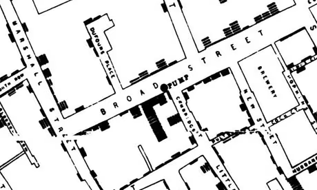
If it weren’t for John Snow’s visualisation of cholera cases in London, we might still think the disease spreads through the air and many more people might have died.
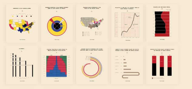 W.E.B Du Bois’ iconic charts played a significant role in advancing civil rights in the US and pointing out racial disparities.
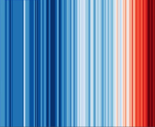
Ed Hawkins’ climate stripes have become a symbol of the climate crisis and have been used by many organisations to raise awareness about global warming.
Charts and visuals are becoming more and more common in publications, and some are becoming iconic like those of the FT or the Economist. And for ONE's work, it can be a secret weapon to get people to care about what we stand for and make a real difference.
Next, read the guidelines to help you make impactful charts or read the ONE data viz style guide to ensure your charts meet our standards.